Comic Terminology
This section breaks down the basic terminology used for comics. This will grow and be amended as we learn more.
Meta-terminology
- Series Title: This is the title of the series.
- Issue Title: This is the title for the issue that appears within the series.
- Letter(s) Page: This is where the author talks about what is happening in the series. There can be quotes from letters from fans, and replies from the author. First issue usually just talks about how the story to get to be.
- Cover Image: Is important to the comic experience. It is the illustration on the cover that gives the reader an idea of what to expect from the story. It should be described in detail as its own section within the reader.
- Description: Is the overview of story.
- Page: The story of a comic is broken down by pages. Each page can contain 2 or more panels (a page with a single image is a splash page). They will usually have between 4 and 9 panels, but there are no rules about this. For Western Readers, panels are usually read left to right, up to down, but sometimes some other layout may be used (i.e., clockwise, counter-clockwise…some kooky writer/artist has probably even zig-zagged!) The layout of the page is important to the narration of the story.
If a comic uses a layout that is confusing, non-linear, or widely open to interpretation, it might not be a suitable comic for us to describe. The Assisted Reader we produce is constrained by the format of the document, and the information will be presented in a linear fashion. If this linear format does not serve to recreate the comic book experience for the reader, it might not be worth describing. Not every comic is suitable for description - ask your editor if you are unsure!
- Panel: A panel is a framed image (except when it is a borderless panel) that appears in sequence on a page. The action of the story is told through these panels. Each panel has its own story. The size, position, and frame of the panel is part of its narration. Movement from panel to panel tells story over time. The size of the panel often refers to a span of time. For instance, a wide panel represents a longer span of time, where a smaller panel represents a short span of time. If the panel has no border it can represent a long pause.
- The following is a list of different types of panels. This is not an exhaustive list. This list can be added to and amended as we learn more about comics and comic description.
- Horizontal panels: a panel with a landscape orientation (wider than it is tall). Usually two to a row.
- Wide panel: a single panel that spans the width of the page and makes up a row by itself.
- Vertical panels: a panel with a portrait orientation (taller than it is wide). Usually 3 to a row.
- Narrow panel: a vertical panel that is narrower than usual. Usually 4 to a row.
- Tall panel: a larger vertical panel that spans more than one row. Usually spans two rows, and there will be other panels in the rows, beside the tall panel.
- Square panel: a panel of equal height and width. Usually two or three to a row.
- Borderless Panel: Is used to describe a panel that has no borders. These images may bleed behind other panels. See bleed for more details.
- Insert Panel: Used to describe panels that float over a borderless panel or splash page.
- Splash Page: A page with one image that takes up the entire page. It may have gutters, or bleed to the edge of the page. It may also have insert panels set on top of the splash page image.
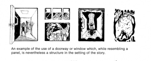
- Frame: The frame is the border around the panel.
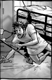
- Sometimes the frame can be an image such as with the following two examples:
“The entryway to the room makes up the frame of the panel.”
- Gutter: The space between panels. This may be black, white, a pattern, or something else.
- Tier is a single row of panels. There can be one or more panels per tier. In the comic book descriptions we often just refer to a Tier as a row. Make sure to be consistent and only use one term or the other to avoid confusion.
If the comic uses the same gutters all the way through the issue, (e.g., they are always white), then it only needs to be stated once. If they are one style most of the time, and another style occasionally, let the reader know in the page description when it changes. If they are different on every page, let the reader know what they are using in every page description.
Graphic terminology
- Bleed: Bleed is used to describe an image that goes beyond the border of the page, or panel. It can also be used to describe images that go across two pages.
- Motion Lines: The abstract lines that appear by a person or object to indicate movement. Usually things like shaking or speed.
- Impact Explosion/Starburst: These are visual effects that that are commonly drawn as a starburst or concentrated explosion of lines. Impact explosions are used in cartooning to show impact, whereas starbursts are usually used to show quick movement.
Starburst
Impact Explosion
- Graphic Weight: A term that describes the way some images draw the eye more than others, creating a definite focus using color and shading in various ways including:
- The use of light and dark shades; dark-toned images or high-contrast images draw the eye more than light or low-contrast images do
- A pattern or repeated series of marks
- Colors that are more brilliant or deeper than others on the page
This type of description not often used, and it will be clear by looking at the panels themselves when graphic weight is used vs. when it is not used. Remember not to over describe your panels. Only mention colour or style of art if it stands out and is important to the story, do not describe it if the entire comic is drawn in the same style throughout.


