Table of Contents
Poetry
For the most part, poetry is marked up the same way as other text.
Use Normal style for the content, and Heading styles for chapters, sections, and poem titles.
Poetry is an artistic medium, so we retain direct formatting such as: strong, emphasis, underline, and strikethrough.
Languages can be applied as needed. See the Language section for more info.
Complex Formatting and Producer's Notes
Sometimes you will come across a poem that has more complex formatting that cannot be translated to EPUB.
We cannot retain this formatting for EPUB conversion.
Producer's Note
In these cases where we have removed complex formatting include a Producer's Note section at the beginning of the book.
Producer's Note [Heading Style 1]
This book originally appeared with special paragraph and line spaces that added to the meaning of the text. Due to the conversion process these design elements have been removed.
For more info, see the Producer's Note page.
Common Types of Complex Formatting
The more common forms of complex formatting are:
- spacing,
- line justification,
- and concrete poetry.
In poetry the use of blank space on a page, between lines, words, or even letters, can be used to convey meaning. We do not retain blank spaces.
Lines, stanzas, or entire poems can use right justification to convey meaning. We do not retain right justification.
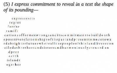
A concrete poem is a poem where the words create a shape on the page that conveys a visual meaning. We do not retain the original shape of a concrete poem.
Example Original Poem:
Example Transcribed Poem:
expresses its
regret
for the
ramifications of former wrongs and its commitment to
build on the positive relationships of the past and
present to move toward a brighter future where all the
people of this land live reconciled as brothers and
sisters and harmoniously steward and protect
the
island together
Images in Poems
Sometimes you will come across images of text in poems. This is a big no-no in publishing and not accessible. See the section on Images of Text for more info.
We transcribe all images of text and mark up with the appropriate NNELS styles.
Sometimes you will find the poet has used an image of a black bar to signify the censorship of a word of phase. In this can you can keep the image and add the alt-text "Thick black bar blocking out word/phrase."
Q&A Archive
Q: I have a follow up question about the poetry book, How to Dress a Fish. In your answer below regarding the sections of text that are censored with a black box, you said, "Keep the black boxes and add the alt-text "thick black line that blocks out word" ". I'm just looking for some clarification around this.
I expected that the black boxes would be images of black boxes since you said to add alt-text for them. I've actually found that all the black boxes I've encountered so far (I'm about 30% through) are regular text in the docx file - so, I can see the word that was originally blacked out in the text and there are no images of black boxes to add alt-text to.
So, to format it to be like the original, I was deleting the word meant to be blacked out and then inserting the Unicode that you gave me for another poetry book, U+25AC. But I just realized that I can instead highlight the word that needs to be blacked out and use the highlight tool to make it black. Then it looks just like the original. Is it okay to proceed that way? There are also some words that are highlighted grey but still legible and I thought I could apply this technique to these as well. Does highlighting words work when you do the XML markup? If this approach won't work, should I stick with the Unicode symbol of a black bar?
A: Sorry for the confusion. Highlighting is not accessible, most direct formatting is not which is why we rely so heavy on styles. Your original approach to deleting and inserting the black bar is the best way to go. Keep it as close to the original as possible. Great work!
Q: I am currently working on the poetry book "Render" and one of the poems, "Following the Leader", was created to look like a list with sequential numbering on each line. Should I format the poem as a list (to avoid confusion from the sequential numbering) or leave the poem as it is because some of the sentences are spread across multiple lines?
A: Recreate it with the same numbers as it is in the original. The poet meant for the lines to break up like that, as this is a common technique in poetry to convey meaning and emotion.
Q: Also in "Render," there is a poem (There's Nothing There)that is created to look like a table and was formatted as a table during the conversion process. Should I leave this poem in the table format?
A: This is not a table, it is three columns. Tables are used for tabular data, in this case it was used to create the layout for the columns. This is not accessible, and is also poor publishing practice. To create columns see Columns section.
Q: I'm wondering about alignment and spacing. The poet in the book I'm editing (Silvija) makes use of left and right justification at some points in the book. Should I align the text as the poet did or stick to right justification only? Also, the book contains a lot of white space (poems are on separate pages). Should I add page breaks in this case? Finally, I just want to verify that the slash ('/') that is used in poetry should remain as written or changed somehow for conversion into DAISY? Thanks!
A: Poetry is a controversial area of ebook production :) NNELS takes the approach of using left justification for all our documents. For some people, text justification may present readability issues. Extended spaces between words and sometimes letters within words can create spaces of white that can visually dominate the text. If you use screen magnification then magnifying these spaces of white, in particular the space in between words, can increase the need for scrolling beyond what would be required if text was aligned to one side.
You can delete all empty pages as we don't have to worry about retaining the original page numbers in this work.
And yes, do use all the original punctuation. TTS is good at reading punctuation. If you're curious how TTS can read text, you can enable the built-in dictation software on your iOS (VoiceOver) or Windows. Keep in mind that TTS software tend to differ Screenreaders.
Q: Currently working on Pendent que Perceval Tombait (poem). I saw a previous Q&A mentioned that all blank pages should be removed (we do not need to keep same page numbering), but we can keep the text on separate pages for the poetry book. I know that we also have to remove page breaks. Is this the exception for page breaks? The answer in that Q&A was not clear to me. Otherwise, how would you keep the text on separate pages? There are often no headings, so I can't even use headings as a divider instead. Each page has 4-5 lines, and then skips to the next page.
A: That was back from when we did DAISY. I removed that line from the wiki. Just format it with headings and no page breaks. We don't keep page numbering in conversion.
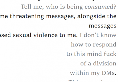
Q: Another question about My Art is Killing Me (poetry). There are parts of the poems that use a different color for the words to convey the author speaking to the reader.
I know that we do not do this. Is this something that also goes into the production note? Or is there a way to emphasize this?

A: Put a not in a Producer's Note stating the original used colour to convey emphasis and was removed in this version. We can not apply our own emphasis as that would be editing the book with our interpretation of the artist's intent and would break copyright law. Unfortunately, as you know, coloured font is not accessible. The Producer's Note is the middle ground.
Q: Working on My Art is Killing Me (poetry) and there is this formatting in one of the poems:
Do I keep it? I'm leaning on *not*. In that case, how do I format it? Just remove the lines?
A: Replace the lines with commas.
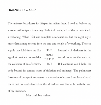
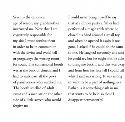
Q: I'm working on "Letters from a Bruised Cosmos" and I need some direction on two poems. I know that we can't maintain the formatting of concrete poems, but in these cases, I'm not sure the best way to "not" maintain formatting… The first poem:
In this case, I'm not sure if the line "The whole in the sky" should be at the end of the poem (this is how it looks when I clear formatting), or if I should have the line in the middle of the other lines (ex. A guilt folds into me like THE humanity. *but without the capitalization). The lines aren't exactly lined up, so this didn't feel like the best fit to me. The second poem:
In this case, I think the lines are intended to be read horizontally, and each section can be read vertically. Do I leave them in section and have them stacked (this is the way it looks when I remove formatting), or leave the sections side by side, and remove the spacing between the sections? Thanks for your help!
A: Unfortunately, this is a great example of a book where meaning is lost with reformatting. There is no clear way to retain "Meaning" for this poems. And since poems are very subjective, it can be a tough call. The best way to make a call on this is to walk through what we consider the intended meaning of the poem.
In the first example "The Hole In the Sky" is supposed to be a hole in the poem, but also it should be able to be read as one phrase. I am leaning towards keeping the words together in one phrase (i.e. "The Hole in the Sky") and inserting it in the center of the poem where the word "the" shows up, maybe in parentheses to help keep it separated as an interjection to the poem.
In the second example, my first instinct is to apply columns to the poem, but there is no way for the screen reader to read it horizontally. Maybe, we could repeat the poem in both reading order?
You should add to the producer's notes that these changes are made. For example: In the poem Title of Poem, the phrase "The Hole in the Sky" originally when over the center of three lines. I this version it is inserted as a single phrase in the center of only the first line. In the poem Title of Poem, the original was styled to be read in two ways. In this version we have repeated the poem twice to retain the multiple reading order options. You can rephrase that as you wish.


